The Secret To Designing a Great Shopify Store
There are a lot of approaches to designing a website, especially within an environment like that provided by Shopify where a variety of pre-built themes exist. That being said, the focus of this article is to discuss a few specific key parts of the process in our approach to designing custom sites. Even when budgets aren't vast calling for a more simple art direction and a certain development starting point / approach, to some what may seem like additional steps actually helps streamline the entire process for better, faster builds.
Art direction: what it is and why it's necessary
The first step we take in any project once we have brand assets is to start establishing the art direction. Simply put, the art direction is the process of extending branding (logo, fonts, colors) into the more robust context of a website.
You may think that there's little left to interpretation given a proper a brand book, but there's actually a lot of decisions that need to be made during this phase. These decisions revolve around things like layout (standard vs a-typical), use of typography & color palette, or more subtle things like input/button styles, iconography all play into the greater aesthetic which can vary widely based on the summation of all these individual parts.
Below you can see our initial art direction for client Cousins Maine Lobster. Granted here we just have a hero, the layout was very much intended to be standard with clearly defined sections. The overall color scheme is very much the equivalent of going "dark mode", which at the time seemed to set a more luxurious tone.
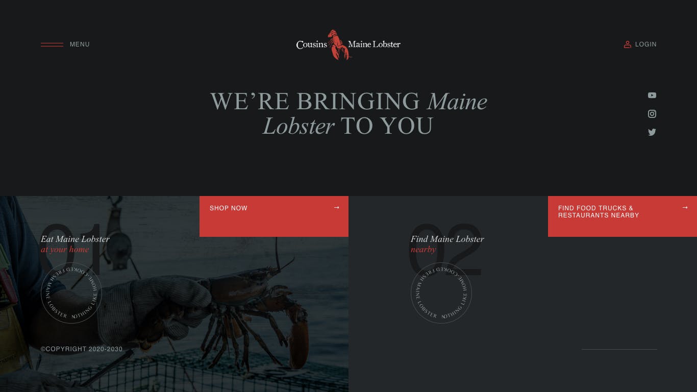
Compared to the final product below, you can see how different the final product is compared to the initial attempt. Both follow the brand guidelines perfectly, but are very different. The layout is much more complex and non-standard with one section free flowing into the next. A maritime theme has been heavily incorporated, as well as playful accents with food, seagulls and other design elements incorporated into the pages. The overall tone is much lighter though both the use of colors and softer shapes incorporated in elements like buttons, modals and image containers used on the page.
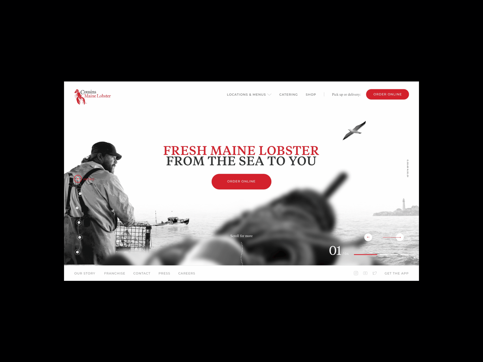
While not all projects require as complicated an art direction, it's still a very important first step in any project that requires custom design. If you were to start designing out pages / modules without first establishing a solid foundational aesthetic, if things were to change you'd be doing a lot of backtracking which is inefficient, costly and overall as a process less likely to give you a design that checks all the boxes. Whether you're designing two custom pages or ten, setting an art direction is a must-have.
Design systems & handoff
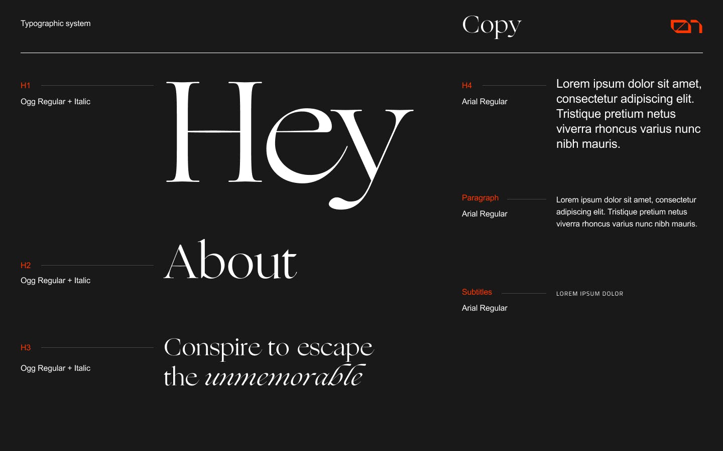
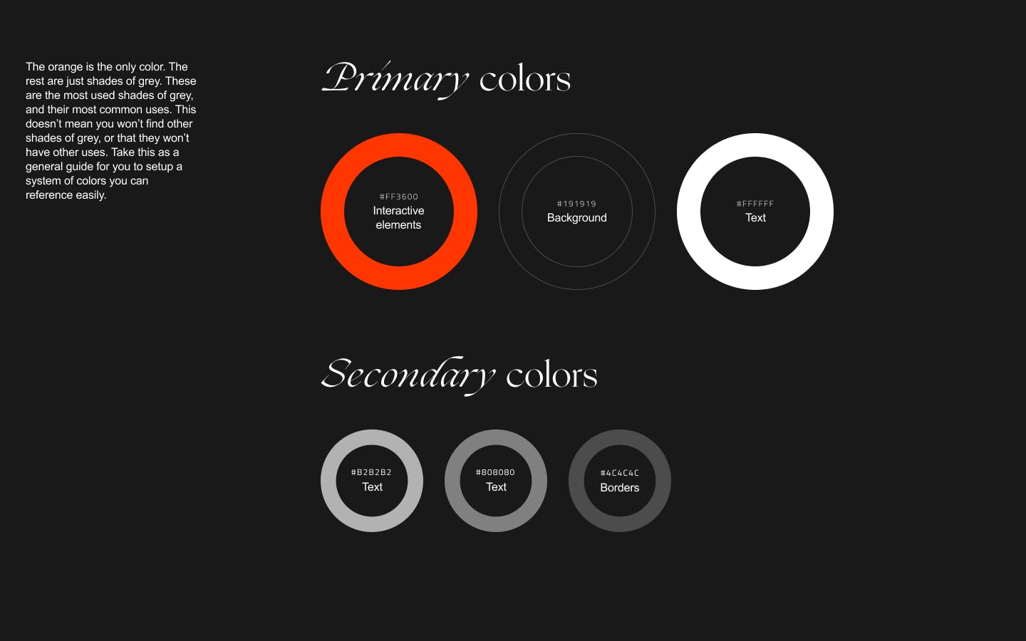
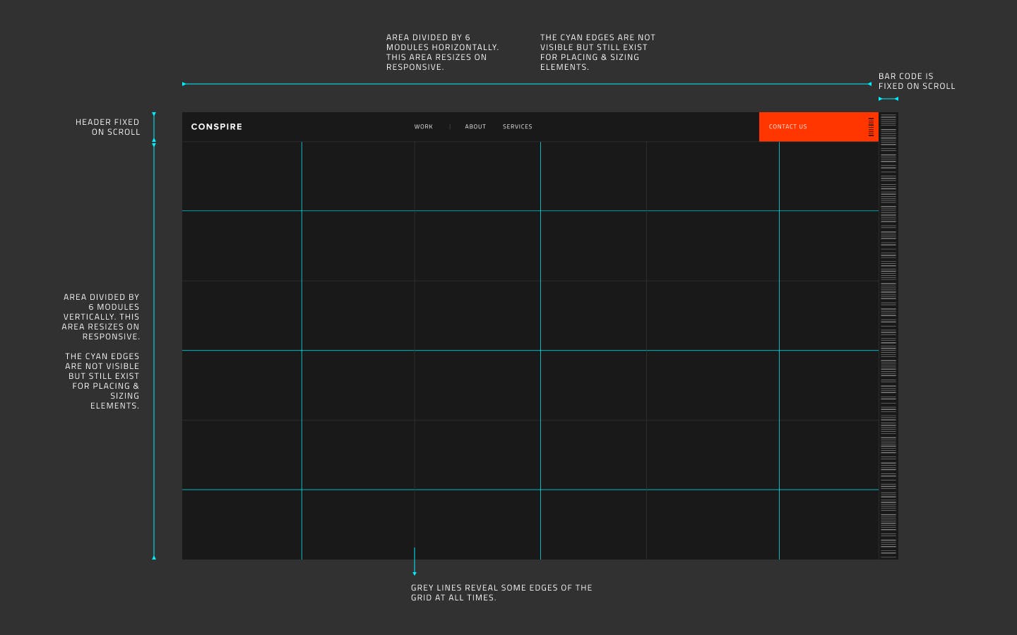
A huge part of the success in a finished website are design systems and handoffs. We need to make sure that a developer is able to implement the same rules that make the design great into efficient code and properly mobile responsive website. It's also essential that developers understand how each section of the site functions, so that sections of the site are properly developed to match their use.
Starting with systems, a common thing we've run into the past when taking over designs is a lack of design system in place. The biggest issue is that if there are no rules in place you end up with an overall unpolished product. Even when the typographic system calls for extreme contrast in the use of fonts, it can all feel cohesive if there are a set of rules in place that apply for everywhere type exists.
Having these definitions in place is also super essential to the development process as well. Can you imagine as a developer being handed a dozen pages and being left to decipher how everything fits together? This too can result in inconsistencies between the designs provided and the final developed product... resulting in unnecessary revisions and not to mention a ton of "pick up" time involved by not having a proper designer to developer handoff.
Below you can see a more practical example of what this handoff looks like for typography, color palette and responsive grid: